
Design is often seen purely visual. But how do you communicate a brand when people can’t see it?
“DBSV” stands for “Deutscher Blinden- und Sehbehindertenverband”. The non-profit organization is Germanys Federation of the Blind and Partially Sighted. Across the country 1.2 million people are either blind or partially sighted. With over 20 regional associations the DBSV represents the interests of people with visual impairments and improves their everyday-life quality. As a semester project under the direction of Prof. Florian Adler at the University of Applied Sciences Berlin I set out to create a new visual appearence for the DBSV and their members.
The challenge of this project was to connect strong functionality with a pleasing aesthetic. This is especially difficult considering accessibility guidelines. In this case I wanted sighted, partially sighted and blind people to identify with the new identity concept equally.
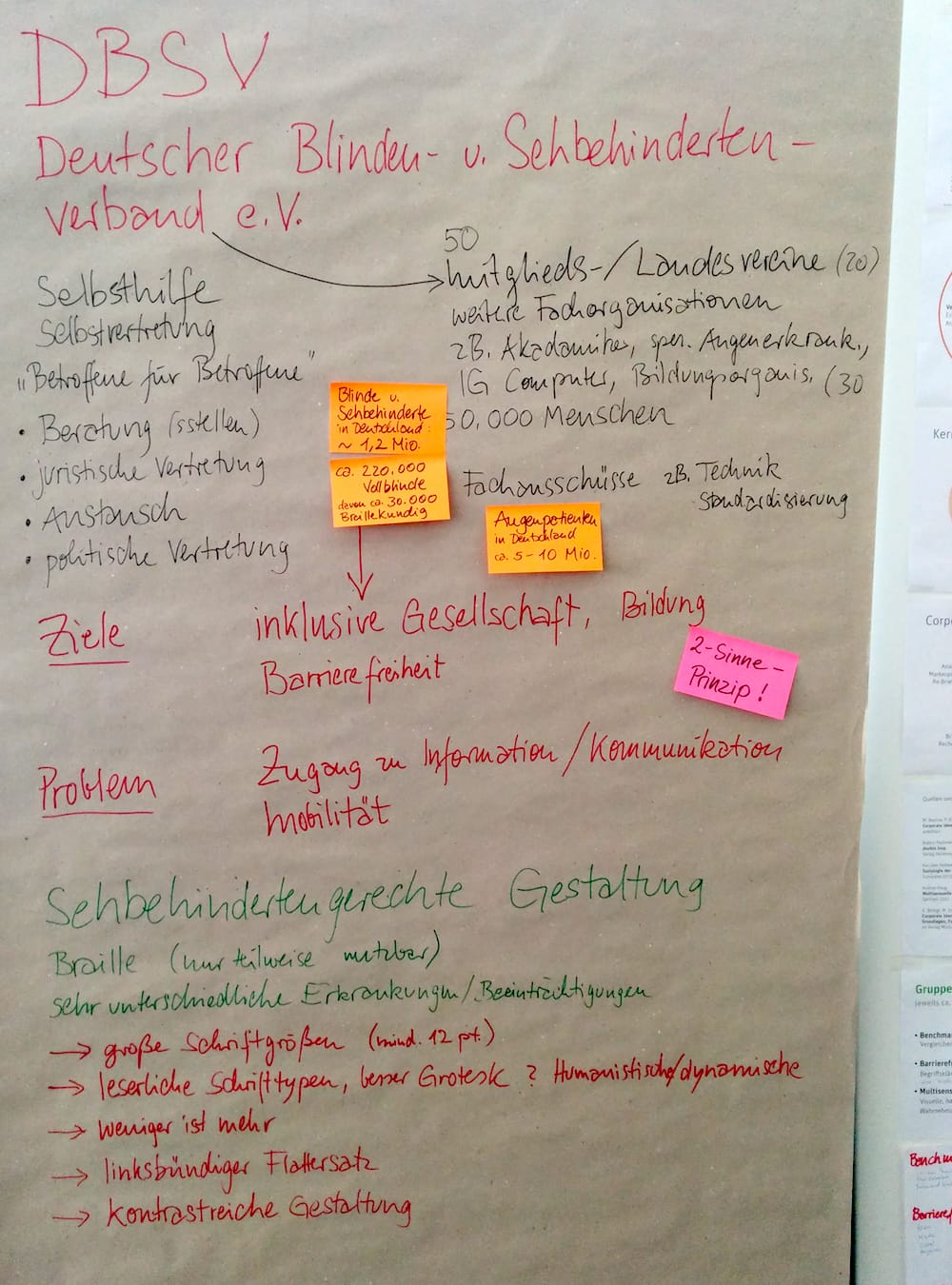
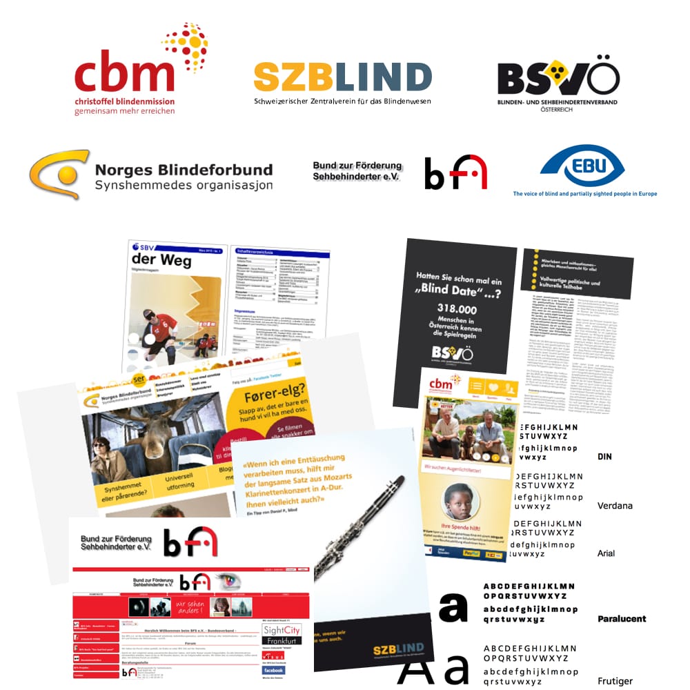
Who am I designing for? What do they do? What is their problem? What are their goals? Who are their competitors? Compare, learn, concept, optimize.
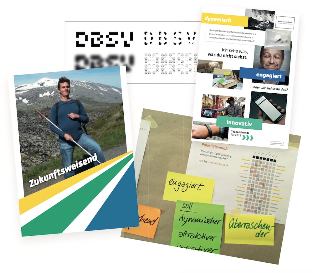
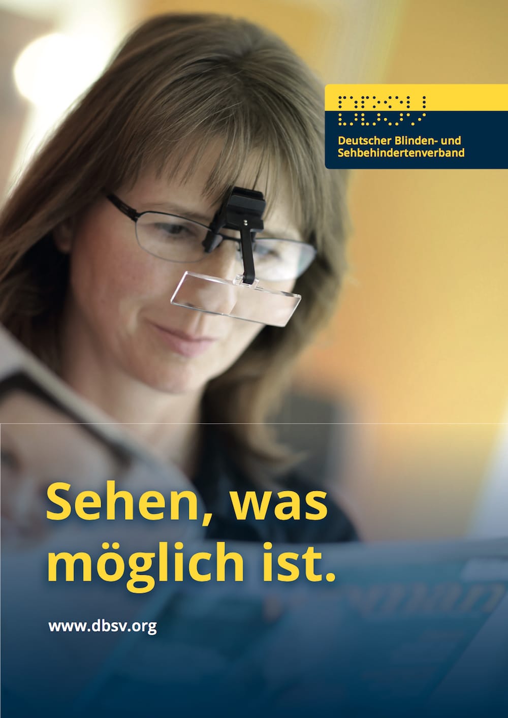
The strongest color contrast is achieved with black and white (21:1). Black and white color combinations don’t represent the attributes we defined in the initial research. In this case I went with a dark blue and a bright yellow. The contrast ratio is 10.5:1 and still passes AAA levels for normal and large text of WCAG 2.0 standard.


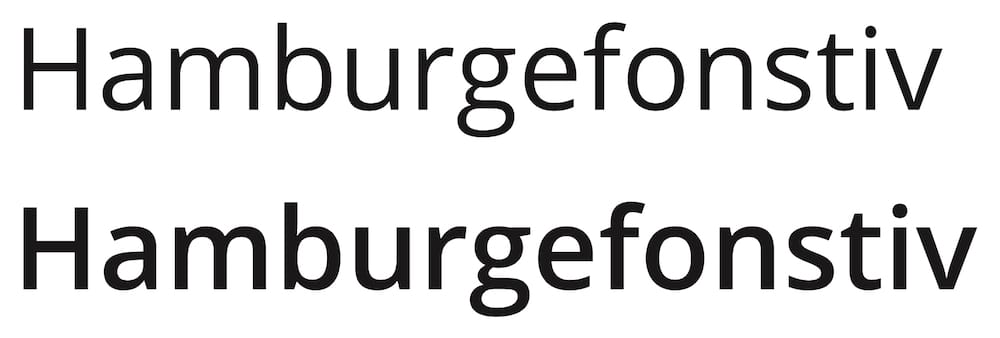
A lot of work has been put into standardizing readability and legibility. The result of this work is the DIN 1450. Following the guidelines from this norm I chose “Open Sans” as the main typeface for the DBSV. The organization couldn’t pay license fees, so it had to be a free typface. “Open Sans” by Steve Matteson is suitable for this with five different weights and a total of ten variants. Most letter forms are unique, open and have a large x-height. A wide variety of languages are supported, covering Latin, Greek and Cyrillic alphabets. For systems where employees can’t install the font, the system font “Verdana” can be used as a similar fallback.
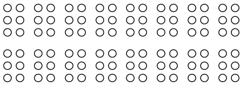



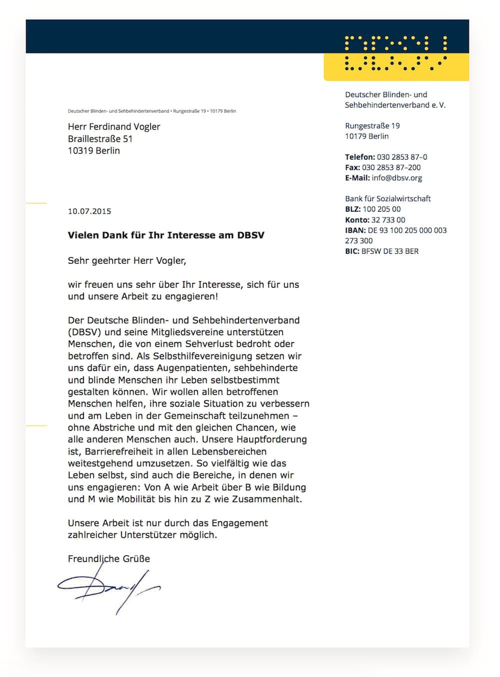

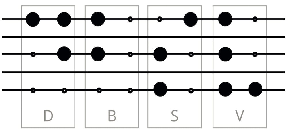
People that can’t see well often have a highly sensitive auditory sense. That’s why I created a short sound logo for use at the end of radio or TV spots. For this I placed the letters “D”, “B”, “S” and “V” with their corresponding Braille letter into a note system. Although I had to slightly adapt some chords, you are hearing Braille letters transferred to audio.
