Projects

Gernot Hoebel

Establishing change in traditional banking

Branding

Context

The German banking system is built on three different models. Germany either has private banks (Deutsche Bank), co-operative banks (Raiffeisenbanken) or public banks like the Sparkasse. Based on a study by the OECD public banks own a share of 40% of total banking assets in Germany.

Many traditional industries today see their business models crumbling. The Sparkasse is a German institution and young customers have new requirements. Hardened structures in big organizations require lots of effort to change. Not only institutionally but also in the heads of people.

Gernot Hoebel (GH) worked in leadership positions for the German Sparkasse for many years and has seen the bank from many sides. He later on specialized himself as a consultant to help establish that will to “keep up with the times” at the Sparkasse.
Research

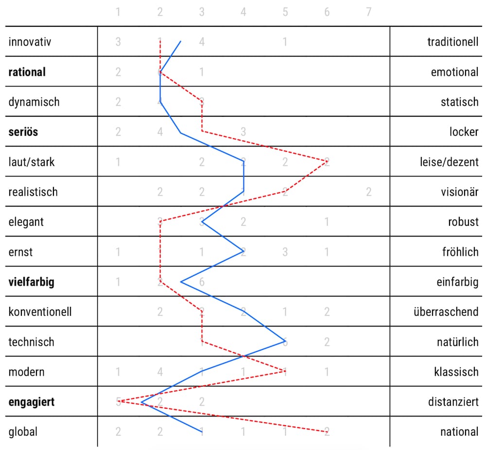
Marking the status quo: Using the semantic differential I asked clients and GH what attributes he associates himself with. Wherever there we large discrepancies I knew that those would be particulary interesting for the visual identity since these values needed to be emphasized.

Clients Gernot Hoebel
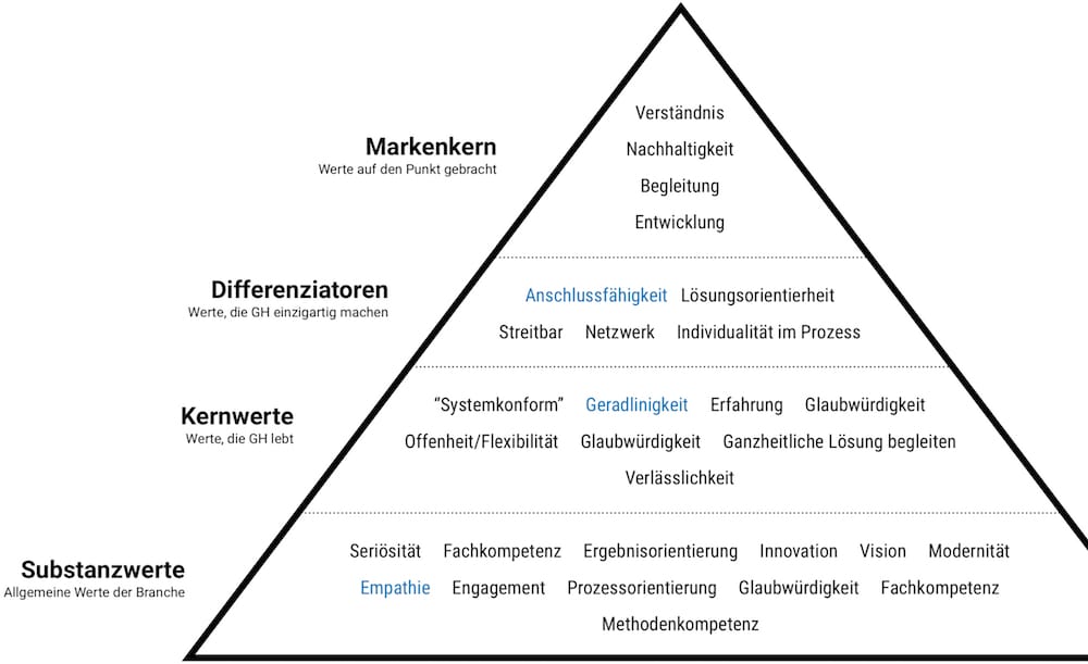
Brand pyramid: In an all-day workshop we took a deep look at the banking consultancy industry. What are general attributes we want to convey and what are the values that differentiate GH? The brand pyramid could also be seen as a funnel that takes words from one level to another.

Defining values

By using different methods we analyzed what characteristics GH has, that I could then translate into visual language. Following the results from semantic differential above the following five adjectives stood out the most: reputable, multicolored, committed, rational.
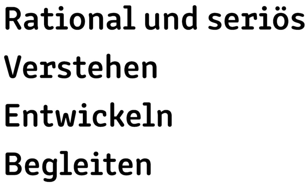
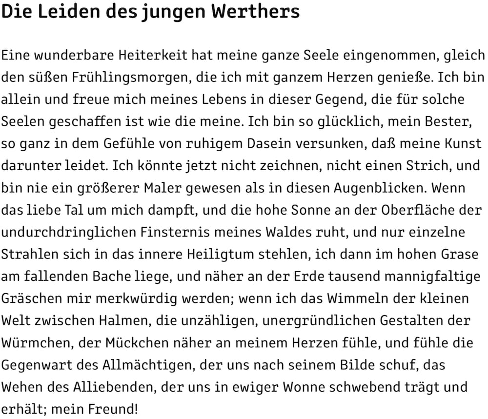
Typography: Change processes are a lot about concepts and the courage to try things out. Experiment, iterate, try something new. The typewriter-esque Clone Rounded by Rosettatype was perfect for this. Interesting details …
… while still remaining legible at small sizes.
Logo: “I belong to the Sparkasse, but I am not the Sparkasse. Think of me as an internal external.”
“If you want to build a ship, don’t drum up people to collect wood and don’t assign them tasks and work, but rather teach them to long for the endless immensity of the sea.”Antoine de Saint-Exupéry
Colors: Red is the brand color of the Sparkasse. There should be a slight connection to this bank, so it remains an emphasis color followed by a blue that’s in the same color spectrum.
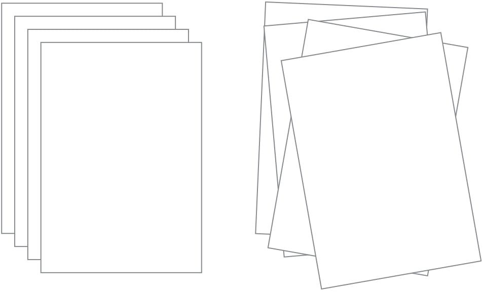
Design idea: Changing the existing “square” thinking. Thinking in concepts and new ways means it can get creative and chaotic from time to time. A pile of unordered paper sheets was the leading idea for the Design variations.
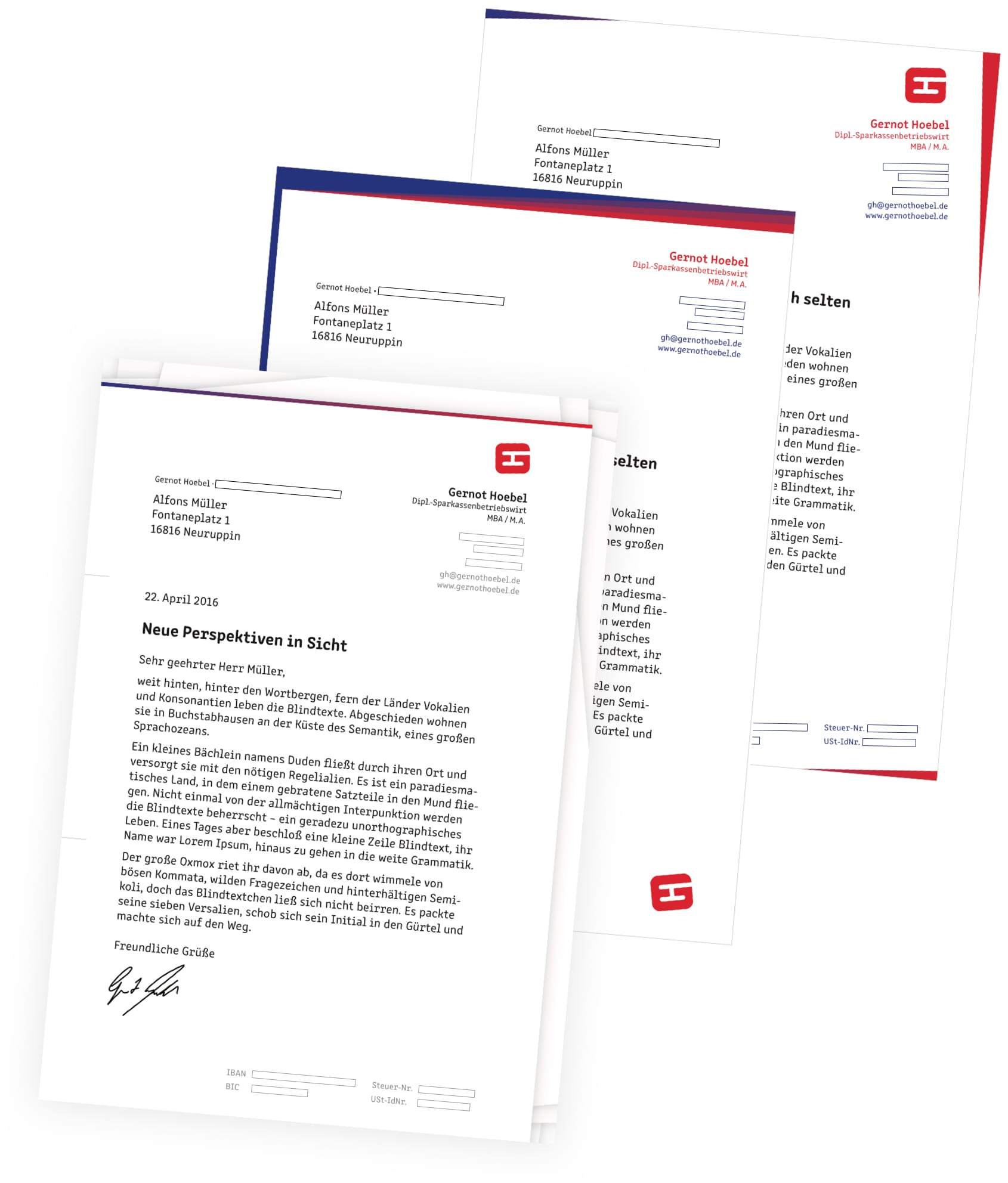
Design variations. Confidential information is blacked out.
The final design. Confidential information is blacked out.